http://www.youtube.com/watch?v=lic3g2E1nZA - embedded code disabled
The first shot is a quick edit of the train speeding past, this sets the scene of the underground, and there is little lighting except for the tinted blue racing past in the middle of the screen. The blue light gives off a creepy vibe which suggests danger. There is an extreme close up of a man’s face; his facial expression suggests he may either be very ill, dead or in danger. His eyebrows are furrowed, making him look confused which tells the audience he doesn’t know where he is or what is going on which implies he is a victim.
As soon as the man opens his eyes the camera slowly zooms out showing that he is wearing a suit and that he has collapsed on one of the seats. The lights flash changing the camera angle to an over the shoulder shot, which suggests that there is someone about but it is unknown to the character or the audience. The whole train is blue which brings out a cold emotionless atmosphere.
It is silent other than the diegetic train sounds of the continuous movement of the train. The character is disorientated suggested by the way he places his head into his hands and rubs his face, the character turns quickly indicated that there may be something there. There is a low angle shot facing up the carriage making it seem intimidating, there is lack of light where shadows are being casted up the wall, making the floor seem ambiguous, the light flashes continuously on and off making the train darker and creepier.
When the light turns on a third time, the camera is faced back on the character and his facial expression shows how confused he is. When the character stands up the lights continue to flash on and off as he slowly walks up the carriage showing the darkness and speed of the train. A skidding noise is heard as he falls over in a puddle of blood.
The edit is very quick showing him fall to the floor where the camera changes to an extreme close up of the blood pouring down his face. A low angle P.O.V. shot shows his shaking hands covered in blood; the light causes a lot of shadows on his hands making the blood look black while it drips off his hands. Another quick edit is used with a fast zoom to capture the character lying in a large puddle of blood.
As the camera becomes another low angle shot the character tries to get up, he grunts while slipping in the blood to emphasise how much there is of it. A mid shot shows him clinging to a pole. The carriage seems misty in the background, contrasting against the dark figure. This may show the characters state of mind and the position he is in. There is a quick edit to show his back. The camera slowly tracks over his shoulder, drawing attention to the next carriage and to what he is looking at. This creates the sense of danger and makes the audience believe that there is something there- building suspense.
The camera cuts back to show the man slowly straightening up, his expression one of caution and fear. The volume of the music gets louder as the man approaches the door to the next carriage. He walks towards the camera until his face is in a close up, showing his facial expression. The audience can tell he is scared but cannot see why. This builds up tension and suspense. The lights continue to flicker black and blue.
The camera zooms into his blood soaked back, suggesting that something is about to happen/appear. Another shot frames his face behind the carriage window- which is soaked in blood- and zooms out showing the rest of the carriage, creating further suspense. The final shot shows the killer hacking apart a victim, but the darkness doesn’t give too much away. A last quick edit is used with a low shot to show the train speeding over the tracks with a flash of light finishing the opening.
By Amy and Matt

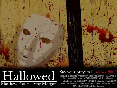
 This is our poster that would be used if we were to advertise our poster for cinema release. This would be placed in cinemas around the world, it could also be seen on bus posters and billboards that are placed in large cities.

 Amy was tied to Matt's table, acting as the victim who is about to be killed.


 adding the other supports keeps the table up from the sides after the end has been cut through. Each extra support keeps the legs from falling in and also keeps the legs upright.